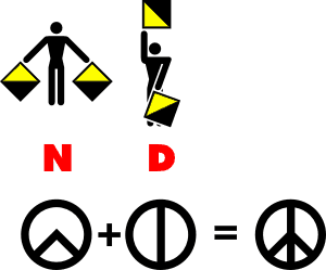
I was reading National Geographic recently and came across the story of how the logo for the peace symbol originated. It was a bit of a surprise since I don’t read it to get stories about graphic design.
 After doing a bit more research, I realized the logo celebrated its 50th birthday this year. The logo was originally created in 1958 by Gerald Holtom for the Center for Nuclear Disarmament. Look at the diagram at right to see how the elements were developed. It is based on the letters N and D in the Semaphore alphabet. Note that the Semaphore font is supplied with CorelDRAW and was used to create the diagram at right. Each of the semaphore characters were simplified to give the two pie pieces. Those pieces were then combined to give the final logo that we all know so well. More details can be found on the happybirthdaypeace.com Web site.
I think this is a great example of how an artist thought outside the box a bit. Rather than using the letters in a Latin alphabet, he chose a symbol font and then simplified it greatly. In Britain the logo is commonly known as the disarmament symbol, but many of us outside Britain simply call it the peace symbol. Now you know how it was created. Hopefully this gives you some ideas for logo design!


According to the introduction to the book by the late Michael Foot, “Dr. Strangelove, I Presume”, Gollancz, London, 1999,credits a cartoonist named “Little Vicky” as a candidate (among others) for designer of the “ND” (or “CND”) logo for the Campaign for Nuclear Disarmament in the early 1950’s..