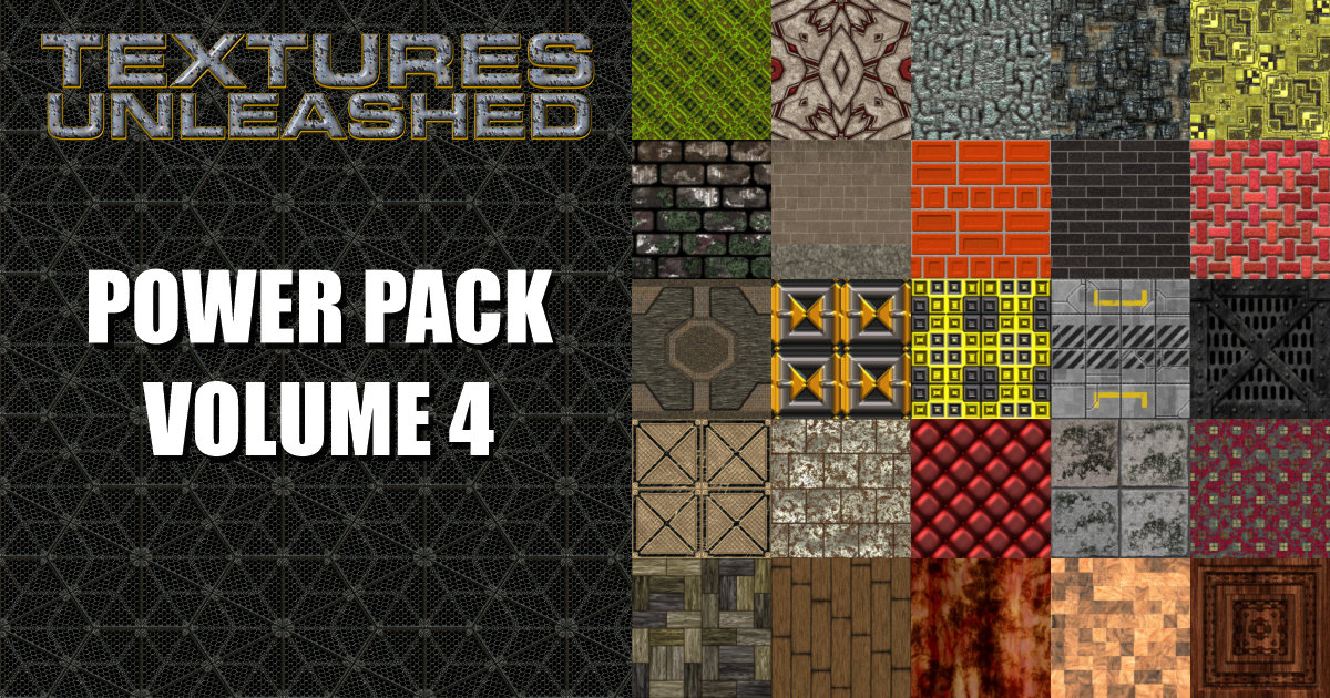
There was someone who often promoted themselves as an expert in CorelDRAW and still claims to be a guru in the world of graphics. Yet this person has often made a horrendous mistake with the main banner on their Web site. It isn’t because they don’t know better as numerous people have pointed out the problem and yet it still exists to this day. I’ll let the offender remain nameless, but I’ll show you an example similar to what is on their site so you can avoid the problem.
For some Web graphics, JPG is the best answer. But it is not the answer for all graphics. In fact, it is a horrible answer for the type of graphic being discussed today. JPG is great for graphics with a large number of colors like photos. GIF or PNG is better for graphics with a limited number of colors.


Look carefully at the images above. Which one looks best to you? Go ahead, make a choice.
One of the images is 10.5 KB and the other is 3.73 KB. Guess what, the graphic that looks best is the smaller file! Hopefully you all guessed that the top image looks the best. It is a GIF file saved with 32 colors. The bottom graphic is a JPG saved at a compression level of 25 using 4:4:4 Sub format. I could have used less compression and it would have looked better. But that would have only made the JPG file larger.
Maybe some of you didn’t see how bad the JPG looked. Below you will see the upper left of the letter “S” zoomed in to 400%.
 Notice all the blotchiness? That is what JPG compression does to an image. Some of you will say to reduce the compression used for the JPG file, but that will only make the file larger and it is already three times as large as the GIF file. I’m not going to supply a zoomed in version of the GIF file since there really isn’t anything to see. There is no blotchiness at all.
So before you save graphics for the Web, make sure you understand the pros and cons of each file format. Those who believe JPG is always the best answer are in for a rude surprise when dealing with graphics containing a limited number of colors. Not only does it look bad, it makes large files. It can also show your clients that you aren’t the right designer for the job.
For those who want to learn more about creating Web graphics with CorelDRAW and Corel PHOTO-PAINT, there is a wealth of information in my CorelDRAW X4 Unleashed book.


Excellent info everyone should know yet only a few do.
How about X6? please share to me.. 🙁