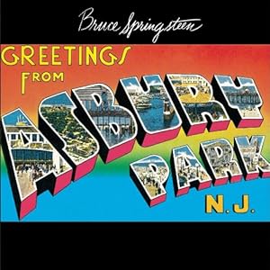
 It is hard to believe that summer is officially over and hopefully most of you got a chance to take a summer vacation. If you went shopping for postcards, you have have noticed a common font being used.
Wh ile today’s font isn’t exactly the same, it definitely reminds me of the text used on Bruce Springsteen’s Greetings From Asbury Park, N.J. album cover. Go ahead and get the Vacation Postcard font and you will soon be able to create your own postcards.
Post a message or a graphics on the Graphics Unleashed Facebook page and let us know your favorite vacation spot or post a virtual postcard you’ve created. Can you suggest even one of your friends become fans of the Graphics Unleashed Facebook page. That way they can enjoy the fonts we feature.
If you’ve missed some fonts, don’t forget to visit Fonts Unleashed where we keep a list of the entire collection of the fonts available for download.


What a great idea. I do a Blurb book every year after the big trip. Make a great cover.
But, as clever and years of experience as I have I can not get the photo on the font and the color on the black edge. Always more to learn.
Even taking it into Photoshop and clipping it does not work. In Draw if I power clip it fills the border with image and the face of the letter goes to white.
What am I doing wrong? or do you have a lesson I get obtain?
Thanks as always,
Phil Scala
I see three unique elements on the album cover. I’d make TWO copies of the text. One would have no outline and would contain the photo. The other copy would be behind the photo copy and would have the outline and any other effects.