Yesterday was a holiday in the US for the government and banks. OK, hold the jokes, I know the government has been on holiday for more than two weeks now. Regardless of the reason, it made for a fairly quiet day in the Unleashed offices. When it gets quiet, I like to play around and see if I can create anything interesting.
The Original Background
 The victim of my experimentation yesterday was a small bitmap used in the background of the header of each of the pages on our Web site. The original version of this pattern is shown at right. It is nothing more than a simple fountain fill created in CorelDRAW with dark blue at the top and bottom and a lighter shade of blue in the middle. It is nothing fancy, but has served us well for some time now. I just wanted a little more “texture” to it and honestly I wasn’t sure how I was going to reach that goal.
Putting the Pieces Together
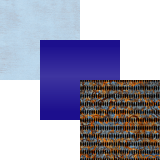
 Loyal readers will remember a post I did earlier this year entitled Tweak Your Seamless Textures to Perfectly Meet Your Needs and yesterday’s experimentation followed similar lines. For this project I used a total of three pieces, each of them shown in an exploded view at left. This time I tackled the project in CorelDRAW rather than Corel PHOTO-PAINT. Why? Because the original blue fountain fill was already a CorelDRAW file.
The backmost piece of the new pattern was the same background used in the earlier post. It is named Sandblasted Rust and is part of Textures Unleashed Volume 2: Metal. I put it at the back of the CorelDRAW page and made no changes to it. On top of the Sandblasted Rust seamless texture was the original blue fountain fill. I wanted the fountain fill to pick up just a hint of the pattern from the seamless texture. I applied uniform transparency to the fountain filled object using the Subtract Transparency operation at a level of 15%.
I liked the result, but it still felt like it needed something a bit more. That led me to the second seamless texture of the rusted metal walkway. Even though we have released more than 1400 seamless textures to date, this is one still sitting in my vault of unreleased products. It became the topmost object in the file and I wanted to subtly make its pattern blend in with the existing file. One again I applied a Uniform Transparency using the Normal Transparency operation at 95%.
The New Background
 At right is the result of my experimentation. You may have to look closely to see the changes I made as they are very subtle. Given that I was generally happy with the original, I wasn’t looking to make drastic changes. Yet blending in the two different seamless textures allowed me to give the background pattern a little big of a rougher look. If you read this post on the blog page (at least on the day this post went live), you’ll see this new background pattern used in the top header of the page.
Are you overlooking the usefulness of seamless textures in your projects? I hope that this project shows you yet another way they can be used. Should you want more resources, please explore the many choices provided in our Textures Unleashed collections.


0 Comments