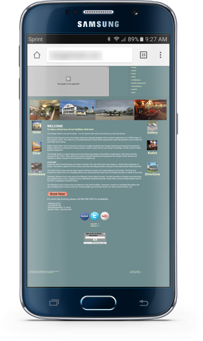
 The pendulum has tipped and there are now more Web visits on mobile devices than there are on desktop computers. If someone comes to a site on their phone and it doesn’t work, they simply move on to a competitor with a working mobile site.
At right is an example of one site I’ve visited recently that fails the mobile test. A flash-based banner at the top just completely fails. Flash hasn’t worked on phones for a long time and Adobe Has Killed Off Flash. Flash should not be used!
Even if the Flash failure didn’t exist, the site is nearly unreadable on a phone. Today it is very easy to build a “responsive” site in WordPress that adapts to the device on which it is viewed.
In the case of the site shown, it would need to be rebuilt in WordPress. While that may sound daunting, the text and photos on the current site can easily be reused. So a skilled developer could move this site to WordPress in a minimal number of hours.
Even if you shrug off the idea of frustrating your Web visitors with a site that isn’t mobile friendly, you may not get any mobile visitors anyways. Google changed their search algorithm on April 21, 2015 so that searches performed on mobile devices would favor sites that are mobile friendly. If your site isn’t mobile friendly, it will rank very poorly if it ranks at all.
I’ve been reaching out to a number of companies recently to discuss a makeover of their sites to make them mobile friendly. Of course there are other great features that can be added to their sites to make them more valuable. My theory is that if I do the site right, the new revenue it brings can more than cover the cost of the site makeover.
How does your Web site look on a phone? If it doesn’t look great, then I want to discuss how it can be re-designed to be mobile friendly. Visit our Web Design Solutions Unleashed site and contact us so we can get to work on your site!


0 Comments