Since we migrated the Graphics Unleashed Blog to a dedicated site in 2015, the layout of the posts was mostly the same. We did make a few minor changes every now and then, but it didn’t change the overall layout much. Now we’ve made a major change a couple of weeks ago and some of you may have already seen it.
In our old layout, the post itself took about 2/3 of the screen on desktop and there was a sidebar taking up the right 1/3 of the page. For mobile users, the sidebar content would appear the post.
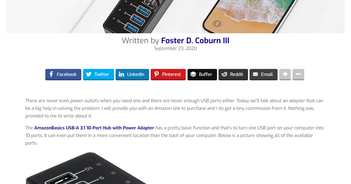
Now we’ve made the post fill the width of the screen on desktop so it is easier to read. The title and featured image are both bigger and more obvious. We hope you like some posts well enough to share them on your social networks and we’ve included buttons to do that at the top of the post. Yes, we love it when you share our content!
Next comes the post itself without any other distractions. We do have some ads within a few of our posts, but now the main ad appears after a post. Yes, these ads help motivate us to keep providing content and we hope you’ll click on ads for items of interest to you.
Below the ad are links to up to three posts similar to the post you are reading. A box below that shows a picture of the author and a bio. Content from the sidebar is below the author box. This includes links to recent blog posts on the Graphics Unleashed blog and on the Web Design Solutions Unleashed blog. You’ll also see one more ad and a box where you can donate to us.
We hope you’ll enjoy reading most posts with the new layout. Thanks to some technology changes, it is easier for us to tweak the layout if there is need for a change.





0 Comments