It had probably been a couple of years since we made the last major makeover to the Graphics Unleashed home page. In the interim, we definitely made a minor change here and there. But it was time to make a big change. So we started out with a blank page and built a new home page.
 For loyal readers who follow us closely, we use the Divi theme on almost every site we design due to its power and flexibility. One of its many features are the hundreds of page layout templates that can be used as a starting point. When we use a layout pack, we typically make big changes to it. Any photos are replaced with relevant photos (or graphics) for the site being designed. Colors are changed to match the site’s color palette. Some sections are removed and others are added. Even with all these changes, the layout pack allows a page to be created in less time and the end result looks great.
For our home page makeover, we did exactly that by using a blog page layout from one of the layout packs. Several of the sections just weren’t a good fit for our site. One section was quite useful and we used it once with only minor changes and then made copies of that section with even more changes.
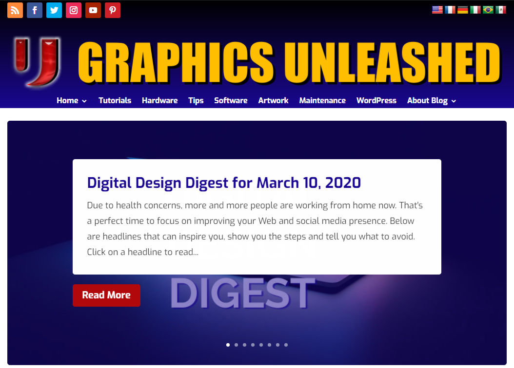
Now let’s go through the meat of the page. Note that the header and footer were not part of the makeover at that time, just the content in between them on the home page. The first section is a slider that automatically rotates through the eight most recent posts. Visitors can also manually go forward, backwards or click on a specific post. As we typically have 3-4 posts a week, this covers at least the last two weeks.
Below that is a section that shows the four most recent posts in the “Hump Day Hardware” category. It would be rare that we post more than one a week in this category so that covers basically the last month. To the right of this section, we put in some of the elements that appear in the sidebar on other pages of the site. This includes a search box, a Google ad (we have to pay the bills), social media follow icons and a form to sign up to receive posts by email.
Then we have two sections with three posts each for the Digital Design Digest and the Tech News Digest. Not only does the new design look cleaner on a desktop computer, it was also designed to look and work great on phones. While we’ll undoubtedly make some changes in the coming weeks and months, the plan is to keep this overall design for the next year or two. Give the new home page a look and we hope you like it as much as we do!
If you have a Web site that needs an overhaul or you simply need a Web site, please reach out and learn about how we can help.






0 Comments