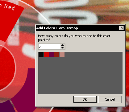
I tend to design projects around the dominant hues found in the bitmaps used in that particular project.
Put down that Twinkie and pay attention! I once charged huge sums for this info. CorelDRAW might still have a bit of a bad reputation due to some of the early users who felt compelled to have every hue in the default palette – in each design! Buck that eyeball-jabbing trend by staying classy – work with a limited range of hues instead.
In X5 or later, create a new blank palette in advance. Drag & drop a bitmap to that palette. A dialog shows.
 See the fictitious samples below to get a feel for how vector elements in the design use hues extracted from the bitmap found in the same project.


That's a VERY cool bit of information. I've been using CD forever and never knew about this. Thanks! Makes me wonder what other neat tricks CD is hiding!