We’ve all seen them. While the visual goal is the same, the terminology is quite different between Corel and other programs. Adobe calls these Gradients.
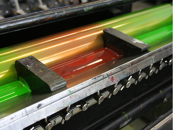
Corel uses the term Fountain Fill. What does this mean? Many years ago, I asked around about why they call it that. On offset printing presses, there’s a printing technique where different colored inks are put next to each other in the same ink fountain.
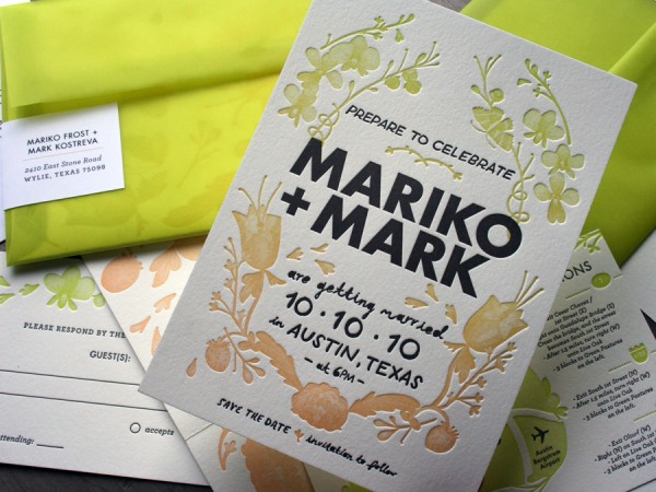
The oscillating ink rollers move back and forth, causing the colors to blend where they touch – this produces a rainbow effect. In the example below, only 2 printing plates were needed: One for the text, one for everything else.

So now you can see that the name comes from an old-school printing technique.
Note: Photos are from Beast Pieces.
While on the topic, someone asked me how to globally adjust factors such as brightness and hue of overall Fountain Fills. See this post. A massive time saver….


This is very interesting…I have been printing for 32 years now and I have never seen more than 1 color in the fountain at a time. I have always used 4 different units, cyan, magenta, yellow and black. I found this very interesting with the different colors in the same fountain.
posted by Alex Izatt