Scaled bitmaps on websites = blurry images

Written by Jeff Harrison
July 1, 2016

Even a large entity such as the U.S. Postal Service can have graphics that are sub-optimal. Compare the difference for how the logo appears as of July 1/2016, relative to how it should look:

usps
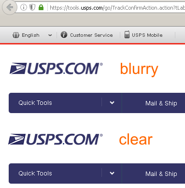
Why does it look blurry? The logo is a fixed dimension PNG file, but it’s later scaled via HTML. Don’t do this.

scaled

Always have your image present as 1:1 to the user whenever possible, especially on corporate branding.

Post Discussion

1 Comment

  1. Foster D. Coburn III

    Even worse, they only scaled it by 3 pixels horizontally and 1 pixel vertically. Just makes no sense.

    Reply

Submit a Comment

Your email address will not be published. Required fields are marked *


This site uses Akismet to reduce spam. Learn how your comment data is processed.

You May Also Like…

Optimizing Your Images For the Web

I think every Web designer is guilty of uploading an image that is a high resolution than what is needed on a Web site. Yes, I've done it more times that I can count. There are some mistakes that are far more costly than others. Today I'm going to go over just three...

View Full Post

Jeff Harrison

Jeff Harrison is a media "Jack-of-all-trades", familiar with most of the major media applications on the Windows platform. Whether it's 2D/print, 3D, audio, video, or web-related - he's working on mastering everything that comes his way. He's a past Alpha and Beta tester for Corel, and has instructed students from all over the world. He runs the popular MacroMonster.com site, the #1 place for CorelDRAW macros. Also check out his youtube page, and his gallery at coreldraw.com.
Build Divi WordPress Site
WordPress Site Care
Divi Tools
Graphics Unleashed Logo