
 There are some memories from my childhood that are very vivid. One of those is sitting in a typing class and learning how to work a typewriter. While it probably didn’t seem important at the time, that skill has helped me as a writer.
There were a handful of things that were pounded into our heads. One of those is that we should always put two spaces after a punctuation mark. Fast forward a few years and I learned that I shouldn’t ever put two spaces after punctuation. Which one is correct?
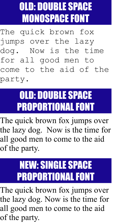
Typewriters used monospace fonts. Every single character had the same width. So a “w” and an “i” were the same. Using two spaces after punctuation was a way to put some separation between sentences. When was the last time you used a typewriter?
For the last couple of decades (or longer), we’ve been using computers to handle the layout of words on a page. Rarely do we use monospace fonts. When using proportional fonts, the space character has a defined width. Using two of them just looks bad. Look at the graphic above right. The middle example of two spaces with the proportional font looks absolutely awful to me. I can spot that extra space from far away. In the bottom example there is only a single space after the period and it looks much better.
My fingers have been re-trained to only type a single space. This happened long ago. Not everyone has been re-trained. I can’t say what will work for you, but this is a habit that everyone needs to break. When I have to layout text for print, one of my first steps is to do a “search and replace” to get rid of all those evil extra spaces.
The same is true for text I’m going to put on a Web site. I spend a fair amount of time removing all those extra spaces. And yet someone spent time to type them in the first place. Let’s all save time! You promise to never type them again and I’ll not have to spend time eliminating them.


old dogs new tricks. yup I’m a double spacer for life… I know I know… 🙂
Hmmmm. I see your point but I’ve been reluctant to switch. I never got that memo. It was only brought to my attention a few months ago that a single space is the new norm. I figured it was just because kids have gotten so lazy that hitting the space bar twice was just too much work for them so somewhere along the way they just quit doing it. Not sure I’m convinced so for now I’ll add the extra space. I like the exercise.