 I think every Web designer is guilty of uploading an image that is a high resolution than what is needed on a Web site. Yes, I’ve done it more times that I can count. There are some mistakes that are far more costly than others. Today I’m going to go over just three images found on the home page of a Web site. I don’t want to embarrass the company, so I will not name the site itself.
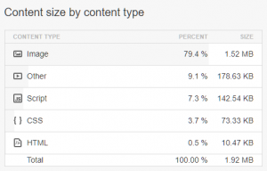
Let’s start by looking at how the site scores on a Pingdom test. There are various testing tools and each assign some sort of grade. We’re worried specifically about measureable numbers. In this case, the home page is 1.9 MB in total size. Of that size, 1.52 MB is images. As a reference, the image of the chart at top right is 19 KB or 1/100th the size of that page. The main photo at the top of this page is 103 KB.
Now let’s look at just three photos on the page in question and talk about how they can be improved. Again, I’m only going to refer to them by a generic name to protect the privacy of the company.
The first image on the page, we’ll call it image1.jpg is 406 KB and it’s dimensions are 1920 x 1280 pixels. Strangely it is scaled to 1996 x 1331 pixels. I typically use images no wider than 1200 pixels as that is big enough for most browser windows. Even if I resample the image to 1200 wide, the browser can scale it bigger. Yes, you lose some quality that way. But we’re trying to make the page smaller and faster!
Scaling that image to 1200 x 800 pixels got the file size down to 294 KB. That’s still fairly big, but it is the primary image on the site and it is more than 25% smaller than before.
Now let’s move to the second image, we’ll call it image2.jpg. I can almost guarantee the photo was added exactly as shot with the camera. It is 822 KB and the original is 5184 x 3456 pixels. Because of how it appears in a column on the page, it is scaled to 653 x 435 pixels. An easy way to fix it is to resample it in your favorite image editor to that exact smaller size. I did that and the size is 93 KB. Just that fix saved 729 KB!
Our third image, image3.jpg, is 313 KB in size with dimensions of 724 x 483 pixels. It is also scaled to 653 x 435 to fit in a column. After resampling to the smaller dimensions and saving, it was 99 KB.
Now let’s look at the total of those three images before resampling. They were 407 KB, 822 KB and 313 KB for a total of 1.50 MB (I let Windows total it so ignore the rounding errors). After resampling the sizes were 294 KB, 93 KB and 99 KB for a total of 484 KB (again, ignore the rounding errors). Making the changes took me about five minutes and I took more than a megabyte off the size of the images and cut the size of the entire page in half!
What are the benefits of doing this? First, the page loads faster. This should lead to more visitors sticking around for the page to load. Next, it may improve the SEO as the search engines do include page speed as part of their ranking algorithm. Also it saves space on your server and in the total bandwidth used by your site. This could save you money!
Next time you need to put some images on a Web site, take the extra few minutes to optimize the images so the pages will be fast and efficient!
Photo by: Adi Goldstein









0 Comments